Here it is, the 3rd and final installment of Race Day. Training is over. The race has come and gone. Celebrations have ended. All that’s left is the analysis….
Before: 13.1 = xy After: y = 4.76x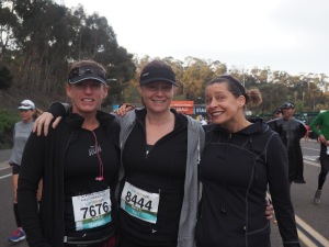
Race Day Analysis:
- I ran the entire 13.1 miles. I ran slowly but I ran it. During a race, I never walk. It’s not worth it because running after walking hurts too much.
- Time: 2:45:31 (2 hours 45 minutes 31 seconds)
- Average Pace (minutes): 12:38 (12 minutes 38 seconds)
- Average Pace (hours): 4.76 miles/hour.
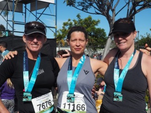
Noreena and Teri
 Noreena (far right) and Teri (middle) finished within seconds of each other. I need to stress that their time doesn’t reflect their running ability. Noreena is an experienced half marathoner. We often joke that she has only one speed – fast. Unfortunately, she tweaked her knee around the 6.5 mile mark which negatively effected her race.
Teri is an experienced half and full marathoner. As mentioned above, her time doesn’t reflect a typical race, but it’s not too shabby for barely training.
- Time: 2:38:15 (2 hours 38 minutes 15 seconds)
- Average Pace (minutes): 12:05 (12 minutes 5 seconds)
- Average Pace(hours): 4.98 miles/hour.
Results Displayed on the Inverse Variation Graph
As outlined in Race Day (Part 1), the red line represents the graph of the equation 13.1 = rt. Each person has a green dot which represents their rate (mph) and time (hrs). The rate, how fast they ran, determines how long it took them to compete the 13.1miles.
 The table lists all the respective rates and times. Since rate x time = distance, I showed how the multiplication results in a product close to 13.1. Because I’m working with real data, I had to round the rates and times – which is why the products are not exactly 13.1.


Results Displayed on the Direct Variation G raph
raph
Now that I finished the race, I have established a speed of 4.76 miles per hour. For every hour that I ran, I traveled 4.76 miles. After 2 hours of running, I traveled 9.52 miles etc…. This pattern represents a direct variation also known as proportional information.
What does direct variation mean? As my hours increase so do my miles.
Direct variation/proportional information can be represented in equation form as, y = kx. K is the constant and in this situation the constant is my speed of 4.76 miles per hour.
The equation is y = 4.76x miles = 4.76(hours)
Using th e Desmos graphing calculator, I created the hours/miles chart seen above. The chart automatically creates the points. To get a line passing through the points, you must input the appropriate equation. I added the detailed ordered pair information.
4.76 actually represents a few mathematical concepts. Therefore is can be referred to as:
- unit rate: 4.76 miles per hour
- Slope 4.76 Rise = 4.76 Run = 1
- Direct Variation Equation: y = 4.76x
Noreena’s and Teri’s running stats:
Again in the Desmos graph program, I’ve created a table to compare my average speed with my friends’ average speed.
I then wrote 3 equations. The purple equation represents the proportional relationship of Noreena’s and Teri’s average speed. The red represents my average speed. The blue equation represents the distance of the half marathon, 13.1 miles

 In this graph, you can see the points without labels. Desmos provides this very useful visual.
If you wish to have a more detailed ordered pair, then 1. you must create that yourself, 2. take a screen shot and 3. import into the Desmos program.
For my friends, their rate of 4.98 can be referred to as:
- unit rate: 4.98 miles per hour
- Slope 4.98 Rise = 4.98 Run = 1
- Direct Variation equation: y = 4.98x
Comparing Rates
The faster the rate – the steeper the line. The table lists the various runners that have been highlighted in Race Day(part 1) with the equation that represents their average rate of speed in mph. To the right of the chart, you will see the lines that the equations create. Since Dash has the fastest rate, his line is the steepest. Marge has the slowest rate/speed, therefore her line not as steep as the others.


The last graph I’d like to show has the same information as above but with a twist. Six points are highlighted. Each point represents the time (in hours) when a runner finished the half marathon. The closer you are to the y-axis, the faster you ran.


I’ve been highlighted Desmos Graphing Calculator for multiple reasons.
- It’s a simple graphing calculator for teachers and students to use.
- It makes working with real data easier. Graphing 13.1 using Desmos is much easier than graphing it on grid paper.
- The program enables you to highlight actual points.
- Desmos allows you to import images onto your graph – which I have done throughout my blogs. This feature, along with highlighting points, will allow students to explore and create descriptive visuals for math presentations.
 How was running the half marathon? Honestly, I had a great experience. The actual race was far more enjoyable than training. Training was tough but I got through it thanks to Noreena.
A few people have asked if or when will I run another. I’ve learned never to say never, but for now I’m content with running shorter distances. 🙂
All pictures were taken by Amy Marquis of No Stone Turned Photography.
Other posts in this series:

Love!
LikeLiked by 1 person
booyah!
LikeLiked by 1 person
Pingback: Race Day (Part 1): -Oh, The Possibilities! | Communicating Mathematically
Pingback: Race Day (Part 2): The Morning Of… | Communicating Mathematically